

Does anyone else look at the world and see colour palettes?
My Relationship with Colour
When I was little, I assumed that everyone looked at the world the way I did. I look at a scene and I see a colour palette - turns out not many people do.
I guess that's why I love to break down my sketches into palettes for the layers in my prints - it just makes sense to me.


Translating What I see Into Art
The main difference between what I see and what I print IS the colours. It's like I'm turning up the vibrancy filter in my brain as I'm looking at the sea and then putting that onto paper.
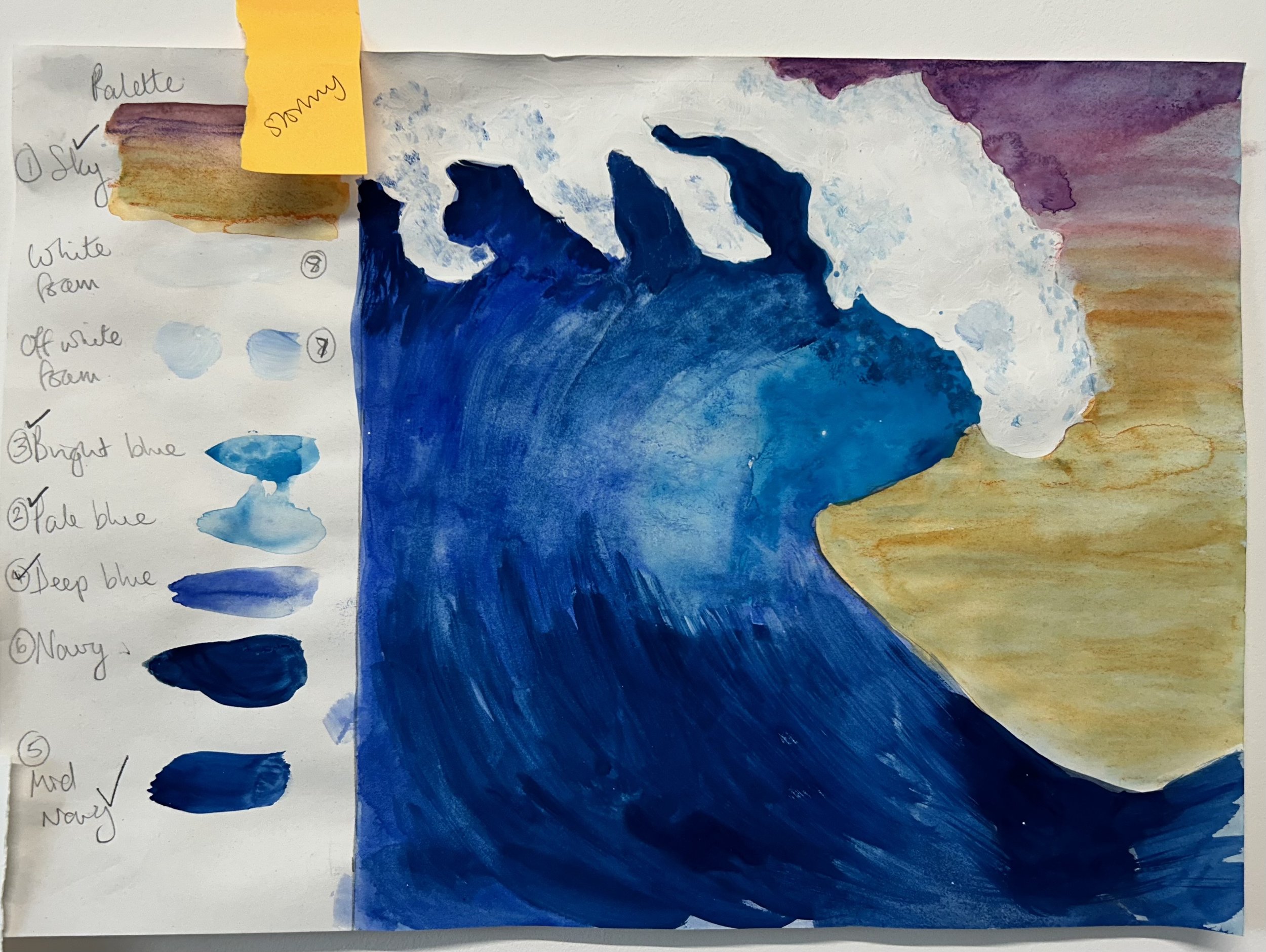
There is a reason I amp up the vibrancy in my colour palettes though...
The Benefits Of Colour

I'm a big believer that colour has a MASSIVE impact on our mood.
Take Seasonal Affective Disorder for example - it's thought that the reduced sunlight in autumn and winter causes a reduction in melatonin production. Low sun = low mood and that's how I feel when I'm in a place that lacks colour.
The shops in winter bring me down with their dark colours and I am not into muted tones and minimalist white box houses (if that's what you're here for you're in the wrong place, ha ha).
A vibrant colour palette is like bringing the sunshine in all year round. That burst of summer we had last week was great but then the greyness comes back and the light dips.
If you came to my home you’d find different colours in each room - each one designed to evoke the mood I want. So it really doesn’t matter what the weather is doing outside because there’s colour and light indoors all year round.
The Vibrancy In Action

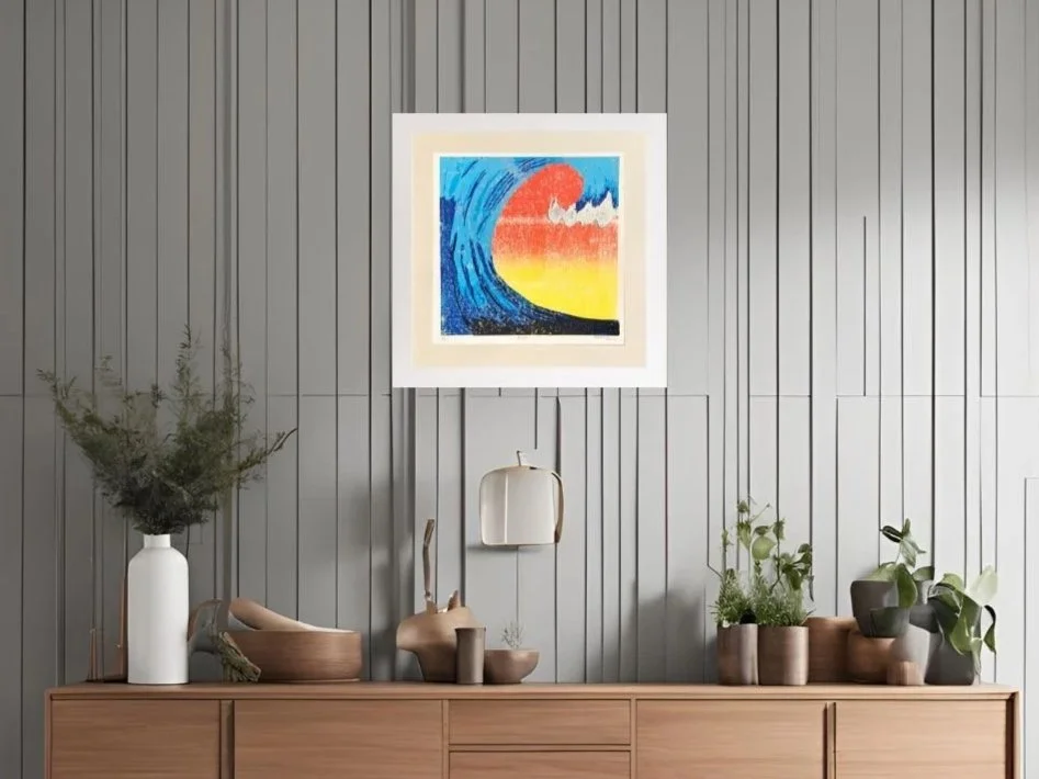
Rush – Limited Edition Lino Print
A snapshot of power, movement, and the magic of the sea.
Rush captures the instant a wave begins to fold — curling and falling, suspended in time, just before crashing back into the sea. It’s that thrilling, gravity-defying moment that makes your heart race. Imagine a surfer poised to glide through, or yourself simply standing still in awe.
Set against a vibrant blend of tangerine orange and lemon yellow, the wave wraps itself around the page like an embrace. Five rich shades of blue and bold whites collide in motion and light, celebrating the energy and raw power of the sea — particularly the ever-changing North Sea, where I find much of my inspiration.
Whether calm or chaotic, the sea is never still — and Rush pays tribute to the beauty in its wildest forms.
The Process
This piece was created using the lino reduction technique — a single lino block, carved back layer by layer, with no way to reverse or replicate the process. With each of the six hand-printed layers, more of the block is destroyed, making this edition truly one of a kind.
Printed by hand using Cranfield Relief oil-based inks on Fabriano Unica 50% cotton paper, the surface holds colour beautifully and offers a subtle texture that brings light and life to every stroke.
Product Details
Edition: Limited edition of 9, hand-signed and numbered
Print size: 35 × 35 cm
Mount size: 40 × 40 cm (acid-free soft white mount board)
Materials:
Fabriano Unica 250gsm paper (50% cotton, 50% wood pulp)
Cranfield Traditional oil-based relief inks
Framing: Sold unframed — bespoke framing available upon request
Packaging: Supplied flat with backing board in protective cellophane sleeve
ℹ️ Additional Information (EU GPSR 2025 compliant)
Made by: The Peacock and the Printmaker, Newcastle, UK
Country of origin: United Kingdom
Contact: hello@thepeacockandtheprintmaker.com
Safe use: Store flat until framed. Avoid exposure to direct sunlight and damp environments unless protected behind glass.
Warning: Cellophane sleeve may present a suffocation hazard — keep away from babies and children.
Environmental note: Cellophane wrap is non-recyclable. Outer packaging is chosen for its minimal environmental impact — including reused bubble wrap and recyclable cardboard where possible.
People can spot my work a mile off BECAUSE of the colour and the pop art style. For me it screams pure joy.
So what I'm saying is, bring colour into your life.
What colours speak to you? If you were to stand in front of a sample wall in a homewares store what would you be drawn to?
What moods do you want in each room of your home?
If you want vibrant beach holiday nostalgia then my Tides Collection is right up your street. You can check it out here.
There's more on the way too. Join The Pride to make sure you get the first look, advanced access and plenty of other benefits too!